![]()
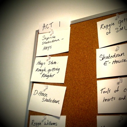
This one has an appeal that is much easier to convey than Omnifocus; Index Card is primarily visual. Its an electronic version of that fixture of edit rooms across the industry, a corkboard.
Index Card
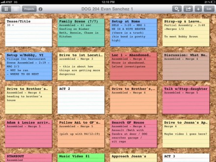
Index Card is an iPad application that lets you make index cards, give them titles and short descriptions, make additional notes on the back of the card, color code the cards, and re-arrange them just by tapping a card and dragging it to a new location. It’s intuitive and looks great.
There’s a few reasons we use corkboards. I know on some shorter format shows they aren’t used, but for the type of show I’m typically working on, the index card is as important a tool for making a TV show as your edit system.
Often, writers will say that they discover a story as they write it. That doesn’t mean they don’t know where they’re headed when they start writing; it means that you learn as you go and change course based on what you learn. The corkboard is one of the ways we learn about our story.
A big part of editing is simply making things make as much sense as possible; laying things out on notecards helps to make it obvious sooner if there are problems. It’s also a great tool for trying alternate ways of telling a story before executing them either in a script or in the timeline of your edit system.
And not least of all, a corkboard provides a great way to talk about a show with other team members. It’s a common language for scenes, and provides a central place to keep everyone updated on the latest idea for how a show is going to be organized.
So – how is this iOS app useful? Personally, I find that making the cards is an important part of internalizing the structure of a show. So to understand what’s going on when I walk in to a project that’s already underway, I’ll make an index card for each scene.
Next, with your cards digital rather than on mashed up trees, you get a few things you don’t in the real world. You can duplicate a layout of cards at any time, so you can try things out and still keep your original arrangement. I’ve yet to see a pack of notecards with 14 different colors, which is what the current version of Index Card allows. You can look at it anywhere you’ve got an iPad – so if you’d like to leave the edit room for a minute and go sit somewhere else to think about things, you can work with your corkboard. You can send a copy of the current board to another person who has an iPad with Index Card on it – “What do you think about this version?”. And if you’re using the amazing Scrivener there’s a rudimentary sync back and forth. You seem to lose the colors but if you’ve started something in either Index Cards on your iPad or Scrivener on your Mac, you can get it from here to there.
As for negatives, I don’t love the way “stacking” cards works, but really it’s not that bad. I wish I could get cards to flow vertically rather than left-to-right. But those are very minor quibbles. For the asking price of $1.99, it’s an amazing deal.
UPDATE:
Tons of new features and still a bargain at $4.99. I wrote another post about it here.

