Hands on Mixing with an iPad Part 2 – Avid Media Composer


Part one of this post addressed using an off-the-shelf solution to provide a tactile mixing board for Final Cut Pro 7. Here, I’ll walk you through using two apps, slightly less off the shelf, to control the audio in Avid Media Composer.

UPDATE/NOTE: At the end of this article I speculate about using the Liine Lemur app instead of the tools discussed here. I have worked that out, and written it up here. This article remains the most detailed regarding setting everything up, though.

iPad Control Surface with Media Composer

Now, Avid being Avid, the situation on Media Composer hasn’t been so easy. It was kind of driving me crazy as I spent much of the past year cutting on Avid again after a long time doing FCP job after FCP job. Every few weeks I’d troll the internet again looking for a way to do this; I’d re-read the Avid manuals and stare at all the menu options again and again to see what I’d missed. Media Composer 5.5 supports a few control surfaces – the Command | 8 , Euphonix Artist series, another Digidesign surface, and the ProMix 01 – but I’d failed to get my AC-7 app to connect successfully.

Then, a few months ago, I stumbled on a message board thread, which lead me to another editor, located in London.
Hands on Mixing with an iPad Part 1 – Final Cut Pro.

For editors who have experience working in audio studios, one of the most painful things about working with NLEs is the audio. Even the best audio subsystem within any video editing system I’ve seen leaves plenty of room for more accurate, less frustrating, and more capable software.

But even when the budget allows sending a show to a mixer who’s got better ears, better software and a quieter room, you still need to make your project sound good along the way. We do this is by a combination of clicking on the mixer windows, or dragging volume level automation up and down in our timelines. This is clearly a sucker’s approach, and extremely frustrating.

Using the iPad for video post: Index Card


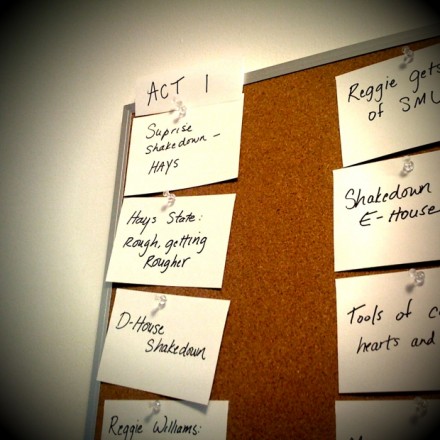
This one has an appeal that is much easier to convey than Omnifocus; Index Card is primarily visual. Its an electronic version of that fixture of edit rooms across the industry, a corkboard.

Index Card

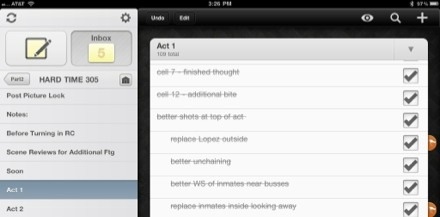
From Hard Time, season 2.

Index Card is an iPad application that lets you make index cards, give them titles and short descriptions, make additional notes on the back of the card, color code the cards, and re-arrange them just by tapping a card and dragging it to a new location. It’s intuitive and looks great.

Time warp.

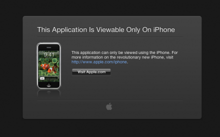
I accidentally typed an old url into Safari while trying to get to my Google Reader (thank you, autocomplete!)…and was treated to a page on Apple’s site that hasn’t  been updated since the original iPhone was released:

This is how things used to be.

Using the iPad for video post: OmniFocus

20110703-083000.jpg Since I got my iPad last year, I’ve been using it extensively to help me edit the projects I’ve cut. Along the way, I’ve found some great tools to help keep an edit (and an editor!) organized, so here’s a first blog entry attempting to describe one of them. I’ll just address a single app in each post, with an eye to giving each application it’s due, and keeping the task manageable for myself as well.

OmniFocus

20110703-034645.jpg

This is where I do most of my organizing. It’s a “to do” type of application, which is insanely powerful and flexible. I used it for about 4 months on the desktop just to keep some lists before I stumbled into the “perspectives” functions, which promptly blew my mind and made the software indispensable rather than something I’d read was pretty good.