One of my favorite iOS apps just got a big update. Index Card has been revised to version 3.0. It’s gained a bunch of neat new features.
What’s new?
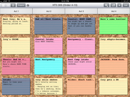
For me, the biggest one is that there’s a whole new view – in addition to the standard card view and the outline view, there’s now a column view:
Cards can now be arranged vertically. If you use the “stacking” feature – essentially a level of an outline – the stacks convert to individual columns in the column view. You can scroll the columns vertically individually, drag a card from one column to another, or scroll the whole screen to see structures longer than 4 acts. You can even rename a column just by tapping on it and typing the new name. Unfiddly.
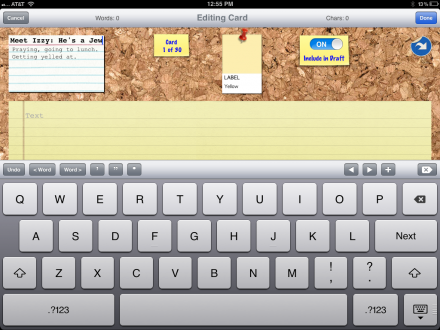
The card editor screen has gotten an overhaul as well.
You can see the front of the card along with an expanded note field at the same time. You can still hit a button up top to spin the card around for additional notes; so it seems like a new field has been added to the data structure. The on-screen keyboard has a handy strip of extra keys, with single and double quotes, word forward and back, as well as character forward and back, a new card button, and an undo key. I sometimes forget that iOS even has an undo button since it’s not visible on the keyboard at all times – you need to tap that ‘.?123’ button, then it appears where the Z and X keys used to be – so when a developer puts that right in front of you that’s great.
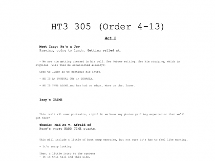
Other features include more choices for backgrounds to the cards, which are nice, ranging from the standard cork to black, white, grey and linen. There’s also an interesting feature called “Preview”, which lets you see the current notecard layout converted to a text document, which you can then either send to another app, or print.
It’s not what I think I want, which is a built in way to print the card layout, but it’s surprisingly nice looking. These RTF documents may end up being useful in some way I can’t anticipate at the moment. I usually end up taking screen shots of the Index Card screen and printing those out; I adjust the screen to show the different acts and then tape the pages together.
I’m sure there are other refinements I’ll notice as I use the app a little more. One of the things I was reminded that I like so much about Index Cards is the number of colors it gives you to work with – 14. I just blocked out a show yesterday on my Mac using something else, and ran out of colors.
All in all, this is a nice update which makes Index Card a lot better for folks in the TV industry. And If your network notes have got you down, just tap into a card for the edit view, and then tap to left and a little down from the arrow on the right for a little surprise.


